
Big Moves Come With Big Tests
Silver’s 30% Shakeout Doesn’t End the Story

I still have plenty of precious metals exposure in the portfolio.
That’s important to say upfront—because after the move silver just made, it would be easy to assume otherwise.
Silver just delivered one of the biggest moves in its history. And moves like that don’t come without consequences. A fast, vertical advance followed by a 30% drawdown will stop almost everyone out including myself. That’s not a flaw in the trade—it’s the nature of volatility. Silver doesn’t whisper. It screams.
And that’s fine.
If silver continues lower and stays below my risk levels, we stay out. If it stabilizes, bases, and gives me a reason to buy, I will absolutely buy it again. I don’t marry positions. I date them. Trends decide how long they last.
What matters right now is this:
precious metals as a group are not broken.
In fact, there are still plenty of precious metals and mining stocks inside the portfolio, and the broader evidence continues to suggest there’s more upside ahead—even if the path is volatile and patience is required.
There are two charts I’m watching closely.
Chart 1: Distance From the 200-Day Moving Average
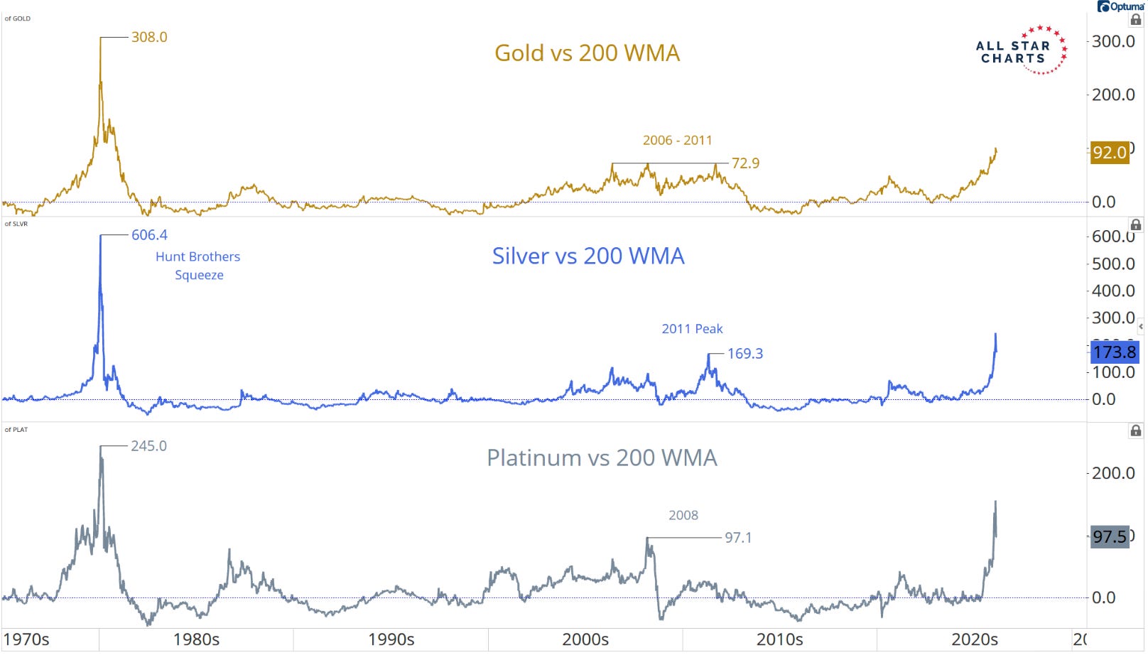
Chart: Sam Gatlin
The first chart shows gold, silver, and platinum versus their 200-week moving averages. Think of this average as the market’s long-term gravity line. When price gets stretched far above it, tension builds.
Extreme extensions like this almost always lead to large corrections. That part is normal. What’s important—and often misunderstood—is what those extremes don’t signal.
They are not the end of the trend.
Historically, every time we’ve seen readings this stretched, the market corrected, shook people out, frustrated momentum traders—and then eventually resolved higher. Sometimes quickly. Sometimes after months of sideways basing. But the pullbacks were bought, not faded.
That’s the key distinction.
So the job here isn’t to predict when the next leg starts. The job is to stay patient, manage risk, and take each position as it comes. If silver keeps correcting, we respect that. If another metal sets up cleanly first, we buy. Price tells us when to act—not emotion.
Chart 2: The Shape of the Yield Curve
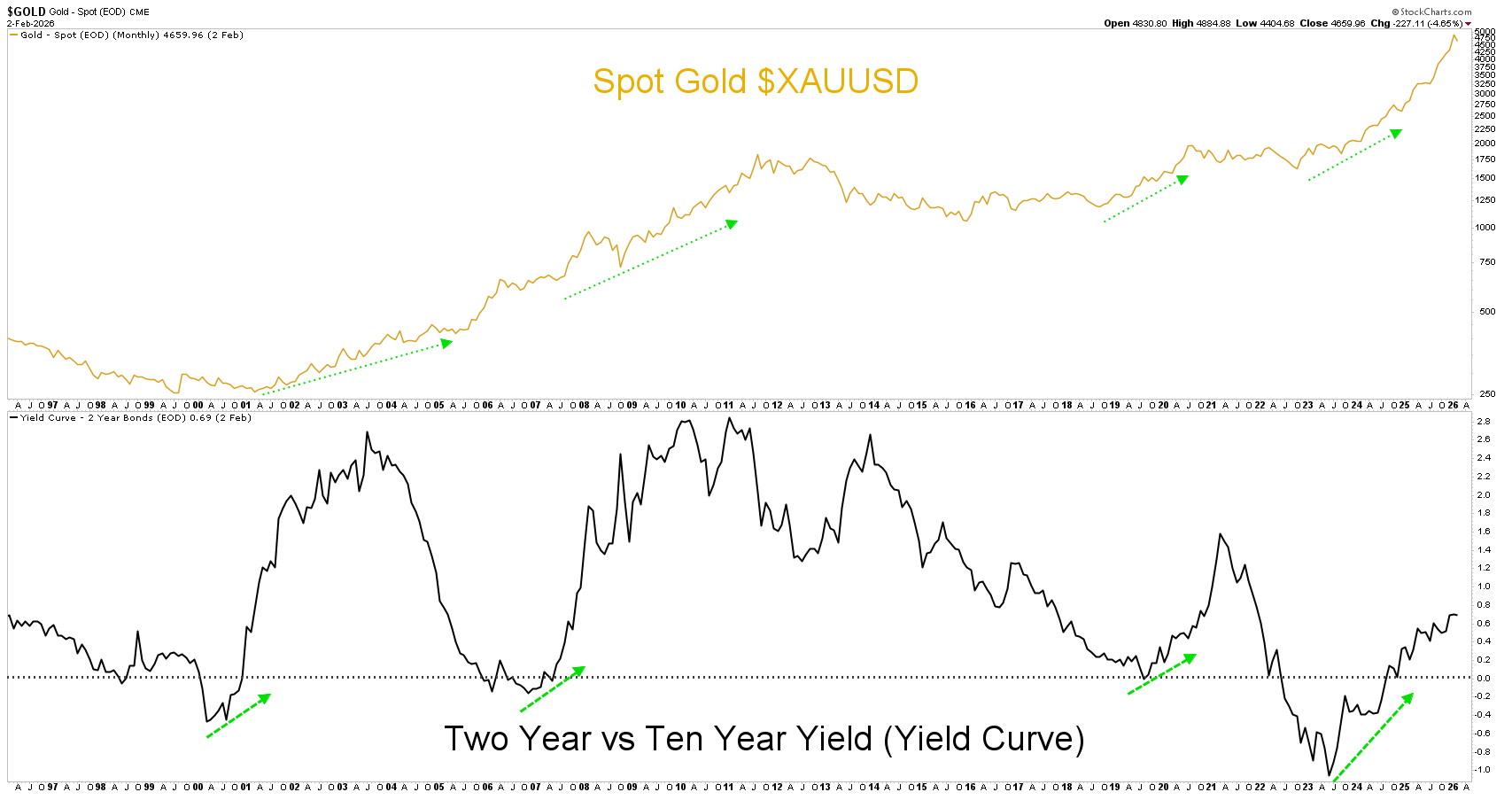
The second chart is the yield curve—specifically the relationship between short-term and long-term rates.
The shape of the curve still matters. A curve that’s transitioning, steepening, or shifting off extremes has historically been a tailwind for precious metals. Until that structure meaningfully changes, the broader backdrop remains supportive.
That doesn’t mean straight up.
It means the path of least resistance remains higher over time.
So my posture stays the same:
Lean bullish
Stay flexible
Manage risk ruthlessly
If silver goes lower, we don’t buy it again.
If a new setup becomes actionable, we buy it.
No predictions. No attachment. Just process.
This is how you survive the volatility—and stay positioned for the bigger move that often comes after the crowd has been shaken out.
Against All Odds Research
Stay Connected:
YouTube: Against All Odds Research Channel (@againstalloddsresearch)
Twitter: Jason P (@jasonp138)
Substack: AAO Research
Support the Bees: Help save the native bees! Learn more and get involved here.
“I don’t marry positions. I date them. Trends decide how long they last.” 🔥🔥
Request more “Buy that shit!” chart patterns ;)